
Things have been quiet on the blog recently, what with ‘one thing and another’. University strikes and global pandemics are not particularly conducive to research! But there have been bright spots, most recently Future States, a nearly-carbon-neutral-conference which bought together over 150 periodicals scholars from across the world to share their research. Although always conceived as a digital conference, the format became startlingly prescient in the current crisis. The talks are still available to view online.
The other highlight from the past few weeks is the result of an extraordinary coincidence. My partner stumbled across a post on Twitter advertising several dozen art and design magazines from the 1920s – 1950s. By the time we saw the post, the owner had already been inundated with requests & queries, so we didn’t think we had a chance. But the owner miraculously got in touch – and even more miraculously, they only lived 5 minutes away. Just before lockdown we managed to meet with Steve Dimmick and Anna Butterfield to view their remarkable collection.
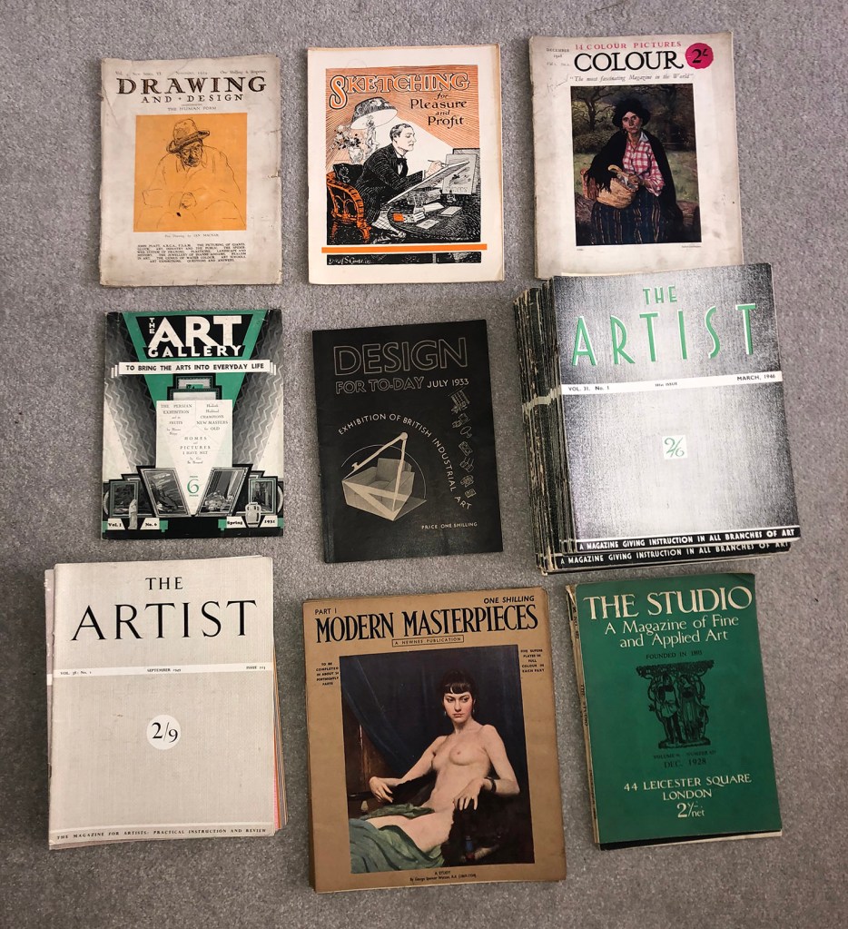
Anna and her family found the magazines while clearing out a relative’s attic. Stored in a suitcase, presumably for at least 60 years (!), they are in remarkably good condition. There are dozens of issues of The Artist, ‘A magazine giving instruction in all branches of art’, right through from the 2nd issue in 1931 to the 262nd issue in 1952.
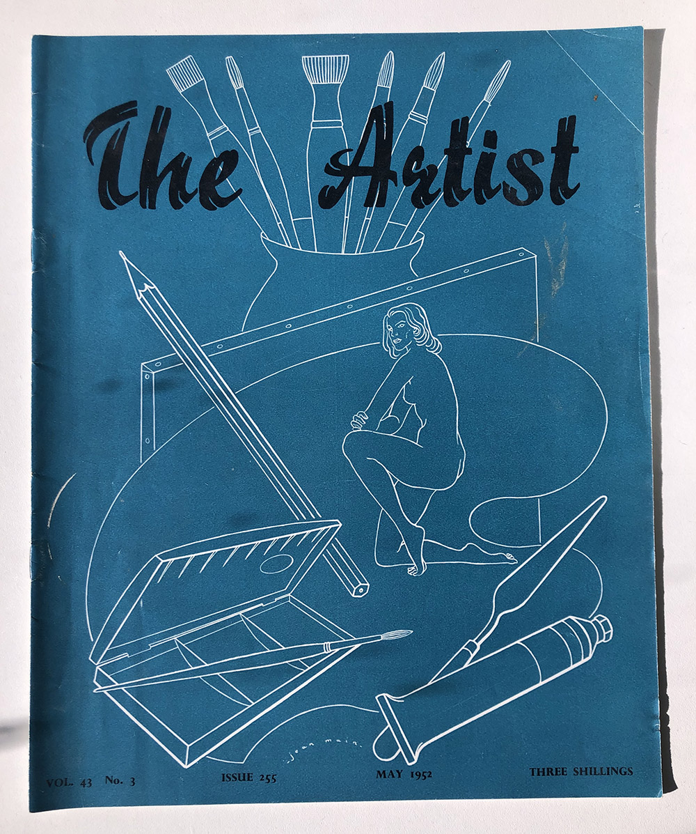
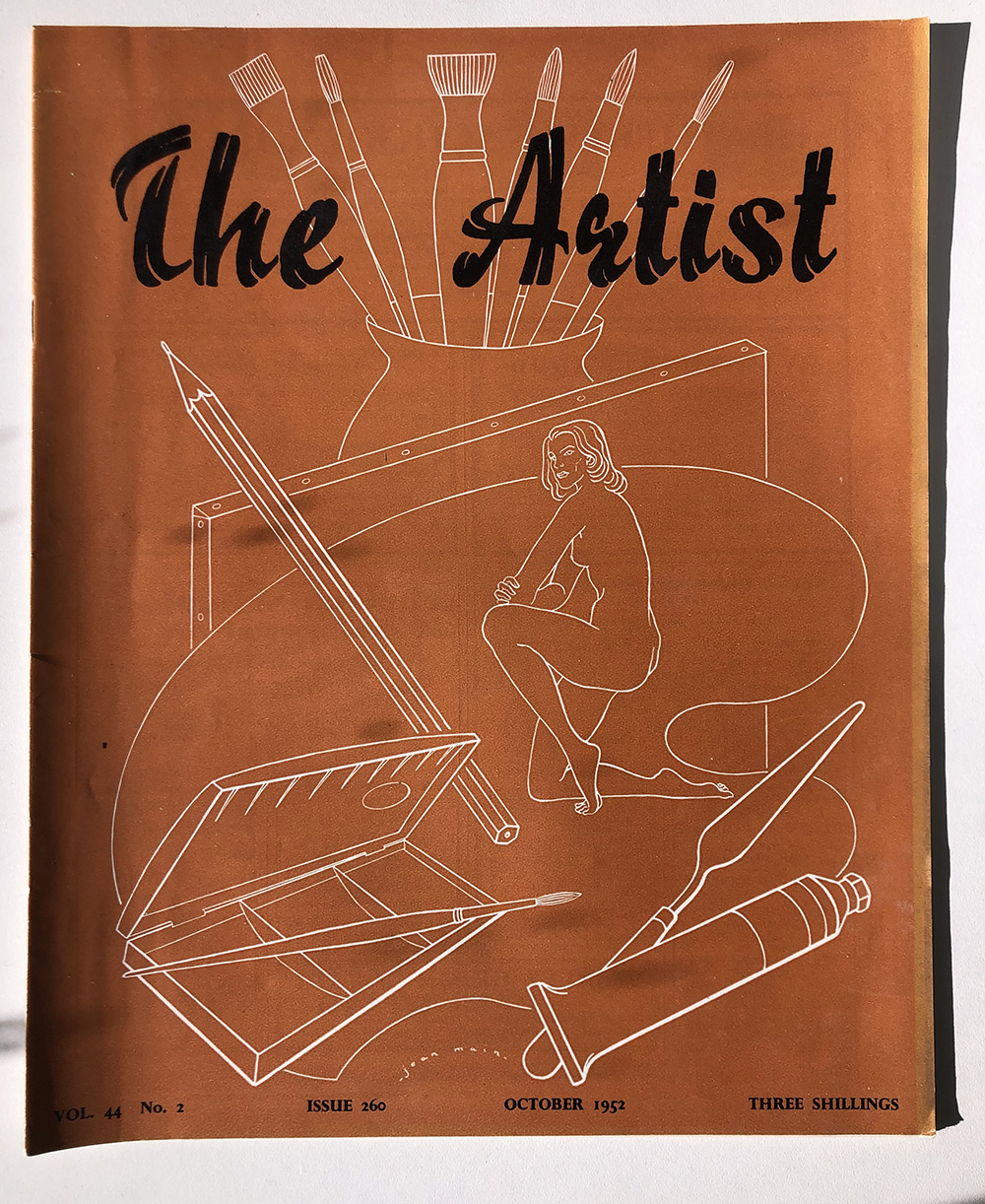
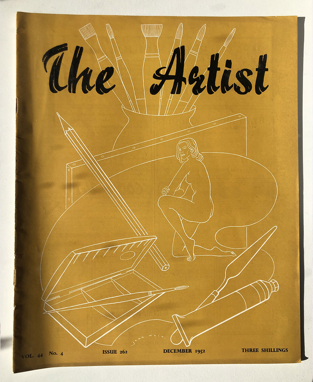
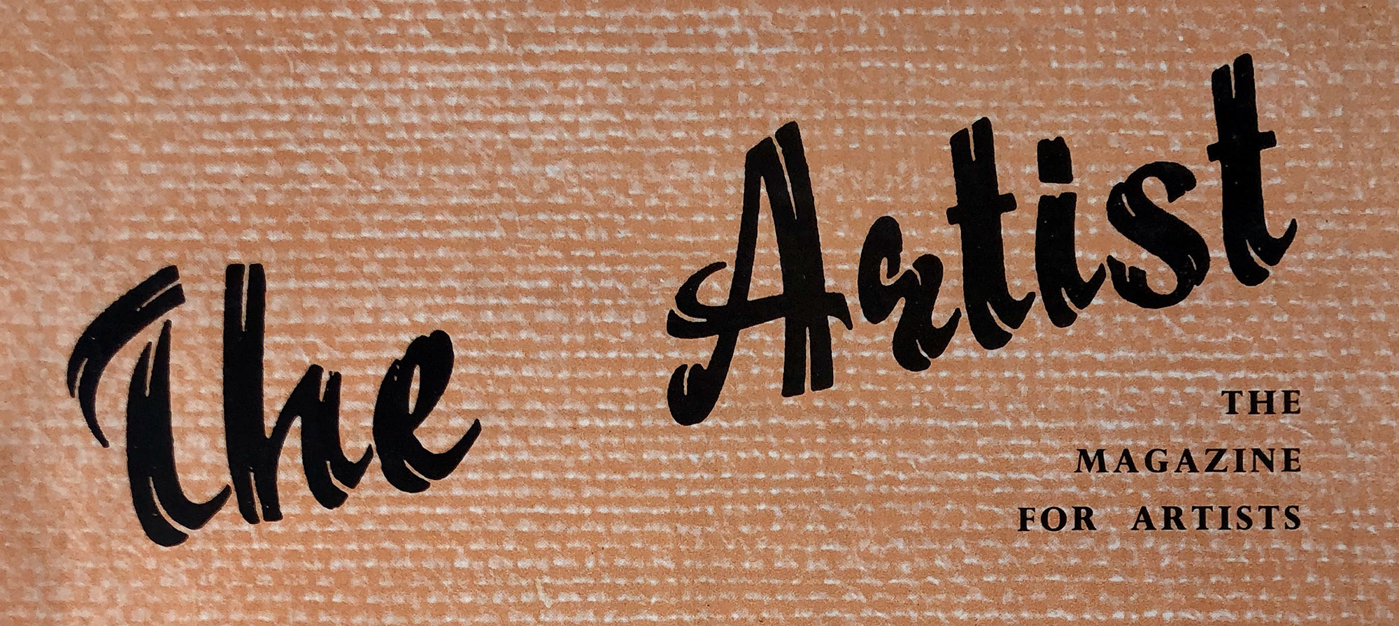
Having so many issues over 3 decades means that you can trace how tastes and fashions in art, design and typography changed, from the Art Deco-inspired lettering on the left to the post-war optimism of this charming ribbon-style font on the right.
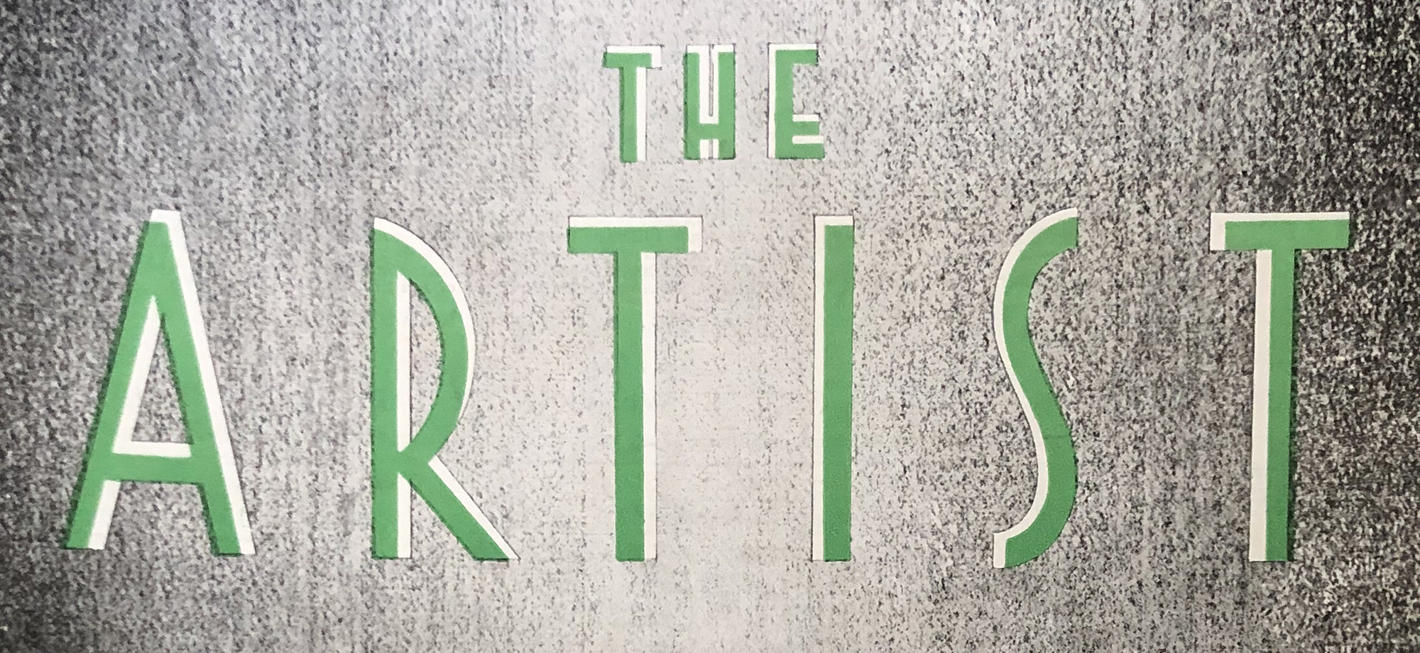
The font on the left is not a million miles away from the one used in posters for the 2011 silent film of the same name – I wonder if the designers were familiar with this interwar British magazine?
The collection includes other wonderful instances of modern art and graphic design. The January 1929 issue of The Studio features a gorgeous cover by my favourite designer, E. McKnight Kauffer, as well as a stunning back-page advert for Eno’s Fruit Salt in the same colours.
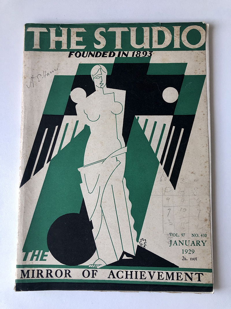
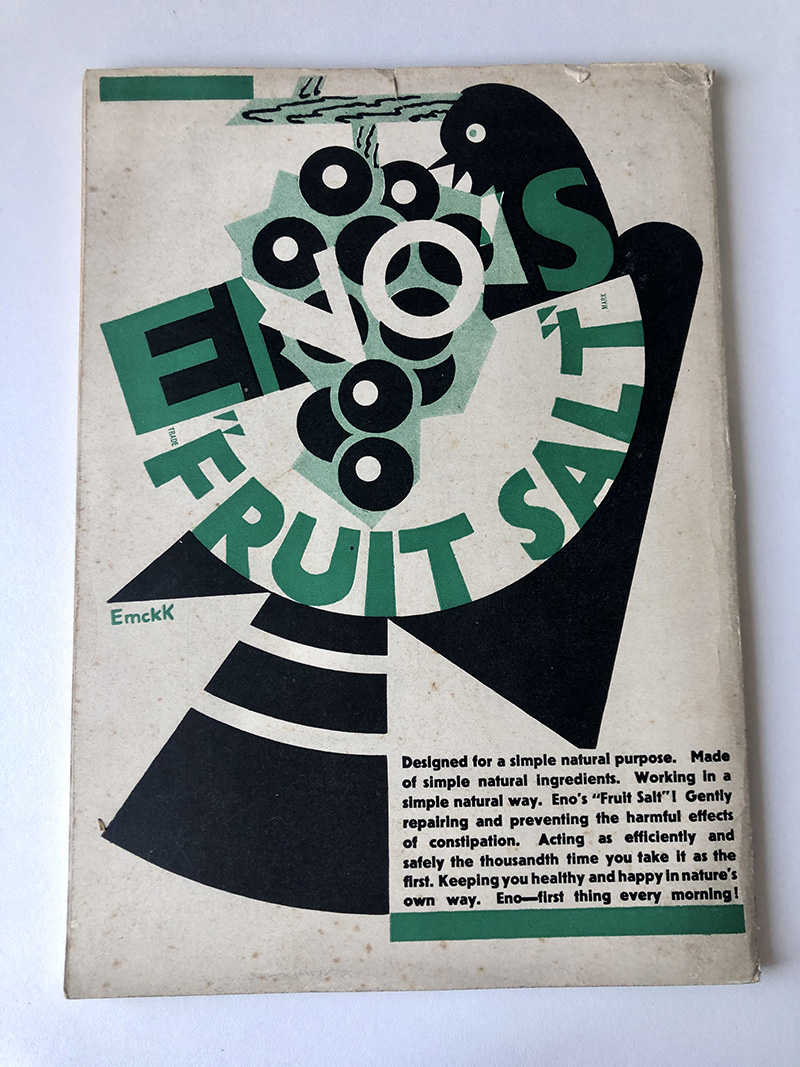
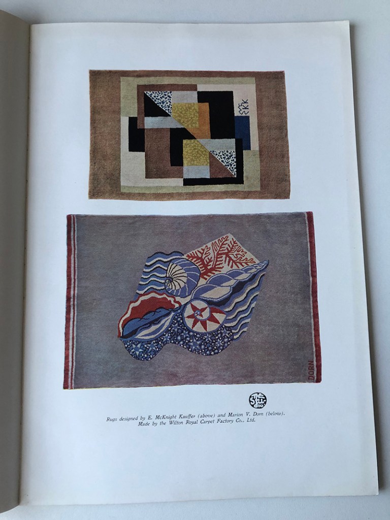
I love the pencil annotations on the front here: the owner appears to have been working out some calculations, or possibly scoring a game. Note too the unusual EMcKK monogram on the front cover. This is mirrored inside in a piece on McKnight Kauffer and Marion Dorn’s rug designs.
Also inside is a wonderful explanatory note about the cover, presumably designed to reassure readers startled by the move to modernist design:
The Studio’s adherence to permanent ideals of beauty founded on the classic tradition of the West is represented by a famous work of Greek sculpture—silhouetted against the symbol of the new age, the aeroplane, pointing upwards as if to soar to heights yet undreamed of.[i]
The note is actually rather useful: I hadn’t realised that the McKnight Kauffer background was supposed to be an aeroplane before!

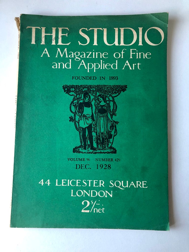
Looking at the cover of the previous issue from December 1928 we can see why readers might have been surprised by the change in direction.
Anna and Steve were kind enough to lend me the collection before the magazines go to their final home in a university archive. Now that we’re under lockdown I’m delighted to have the magazines as my companion. Having the extra time means that I’m able to read them at a more leisurely pace, rather than tearing through looking for articles relevant to my research (my usual practice when I’m in the archive). I’m picking up all sorts of things I might otherwise have missed. Today I’ve been delighted by this charming pottery set designed by Milner Gray entitled ‘Whoopee’. Could any word better evoke the jazz age?
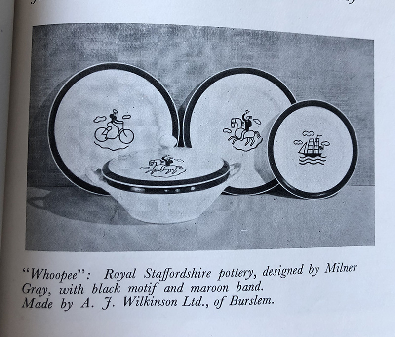
A quick google revealed that Mr Gray’s designs were not met with universal appreciation. The Pottery Gazette wrote that
There are no doubt people who attracted by it and who may even like to possess it but if there are we simply cannot share their taste. Perhaps it has been incorrectly described as a “morning set” and is intended for the nursery?[ii]
Between the pages of each magazine are dozens of other gems like this waiting to be discovered. I’ll share more highlights from the collection on the blog over the coming weeks.
With thanks to Steve Dimmick and Anna Butterfield for the generous loan of this collection. Thanks too to Simon Rendall and the E. McKnight Kauffer estate for permission to reproduce the McKnight Kauffer designs.
[i] ‘Our New Cover’, The Studio (January 1929), 73.
[ii] Pottery Gazette, quoted in Leonard Griffin, Clarice Cliff: The Art of Bizarre (London: Pavilion Books, 2004), 163.

[…] here to catch up with Part 1 of this […]
LikeLiked by 1 person